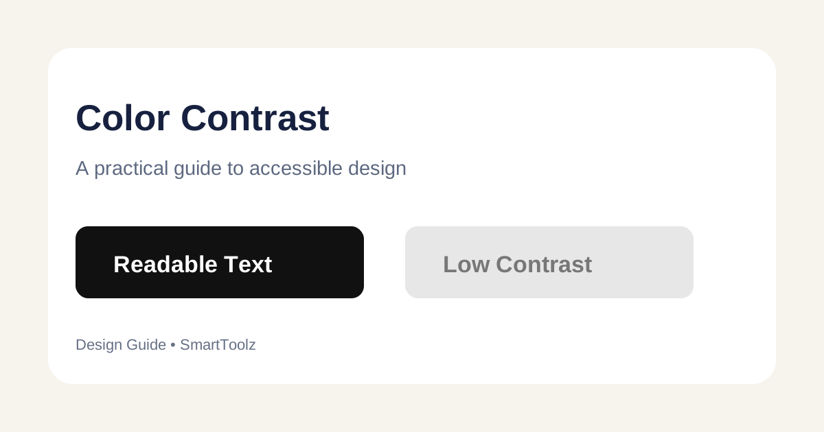
What is color contrast?
Contrast describes the visual difference between two colors. For interface text, the important comparison is usually the text color against its background. A pair can look attractive while still being difficult to read at small sizes.
Why contrast matters
Low-contrast text can be harder to read for people with low vision or color-vision differences, and it can become especially difficult on dim, bright or low-quality displays. Accessibility checks should be part of normal interface design rather than a final cosmetic step.
How contrast ratios work
Contrast ratios are expressed as values such as 4.5:1. The ratio is calculated from the relative luminance of the two colors. Higher contrast means a larger difference between the lightest and darkest values.
Check normal text and large text separately
Accessibility guidance distinguishes between ordinary text and sufficiently large or bold text. Do not assume that a pair that works for a large heading will also be suitable for small body copy. Test the actual size, weight and background used in the interface.
How to check a color pair
- Open the SmartToolz Color Contrast Checker.
- Enter the foreground color used for text or controls.
- Enter the background color behind it.
- Review the calculated contrast result.
- Adjust the colors and test again if the pair is difficult to read.
Common design mistakes
- Using light gray text on a white background.
- Putting text over photographs without enough contrast.
- Relying on color alone to communicate an error or status.
- Checking a color pair but not the real component state, such as hover or disabled styling.
Contrast is only one accessibility check
A readable color pair does not automatically make an interface accessible. Also consider font size, focus indicators, keyboard navigation, labels, meaningful link text and sufficient spacing.
Practical workflow
Test your primary text, secondary text, buttons, links and important status messages. Record approved color pairs in your design system so developers can reuse them consistently.